Medical Costs Finder
Department of Health, Disability & Ageing
60
Participants
3000+
Data points
53
Unique research findings
2
Concepts
What is Medical Costs Finder?
Medical Costs Finder (MCF) is a tool to find and understand costs for FP and medical specialist services across Australia.
MCF:
Aims to increase specialist price transparency by displaying typical prices for specialist services
Allows patients to make more informed decisions about their care
Users are able to see the specific prices for specialists or insurers who have signed up to the site and chosen to disclose their prices

Traffic to MCF is estimated to increase
background
Historically, there has been low levels of voluntary price disclosure from specialists and insurers.
Upcoming legislative changes will mean that disclosing costs are no longer optional.
There has been previous user research on the MCF website experience done by the Health Design Lab.
Research objectives
Research
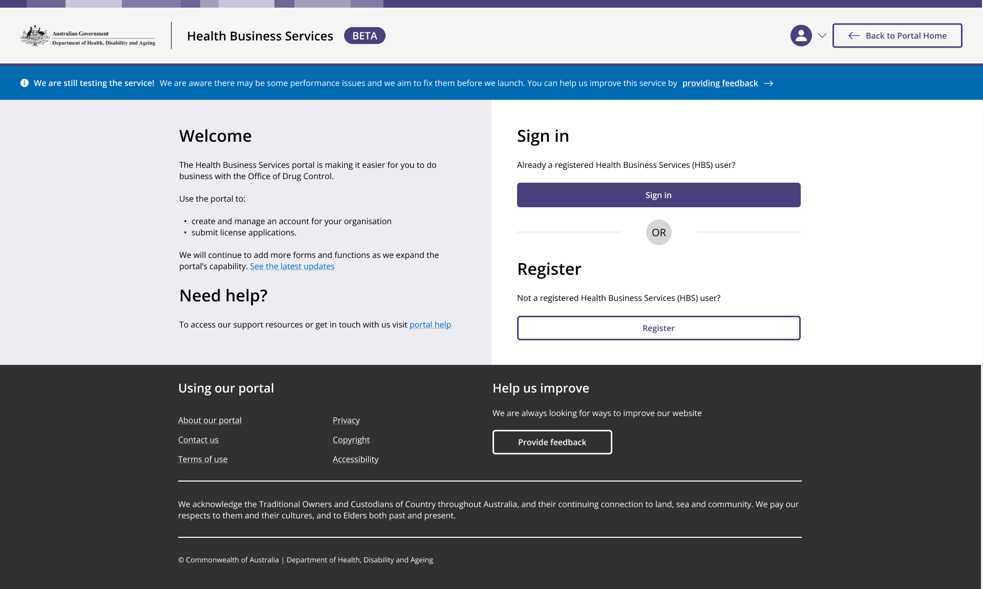
Based on this, I began creating a set of wireframes using the components made by fellow designers thus far, as well as the patterns and layouts they established in other services.
Goal 1: Explore how the MCF website can be redesigned to ensure a seamless user experience that aligns with upcoming policy changes by testing a proposed future state website with users.
Goal 2: Assessing the current MCF website and the Design Lan design proposals against best practice usability heurestics to inform the conceptual prototype to be used in testing.
Goal 3: Capture reccomendations to inform the delivery of future MCF website enhancements that would ultimately increase website traffic (especially to individual specialist fees).
Gathering real user feedback to make data-driven decisions align with whole-of-government standards such as the Digital Experience Policy and Digital Service Standard.
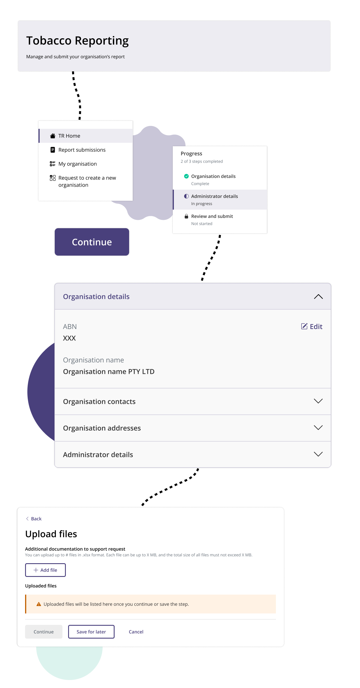
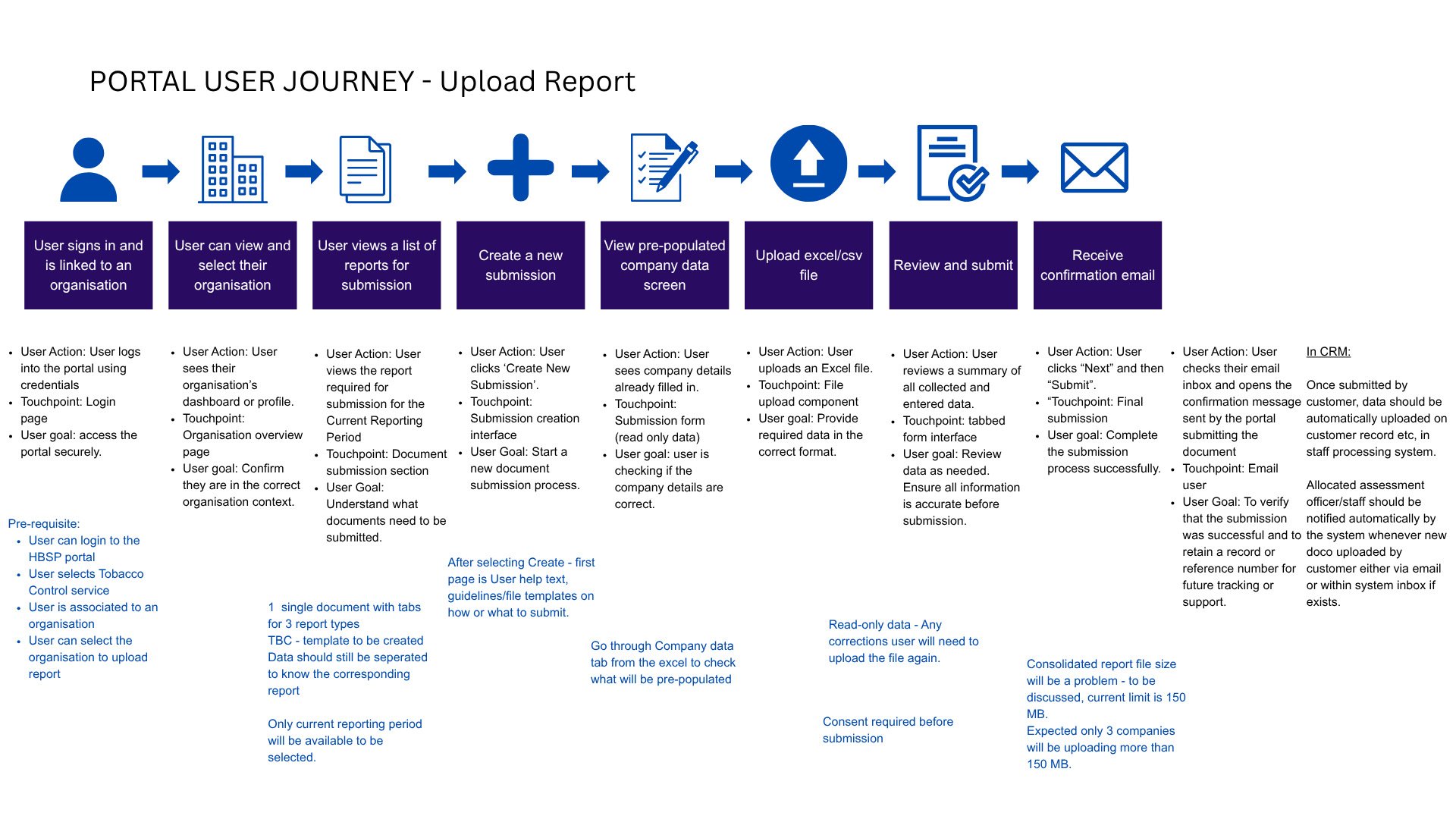
Signing into the portal
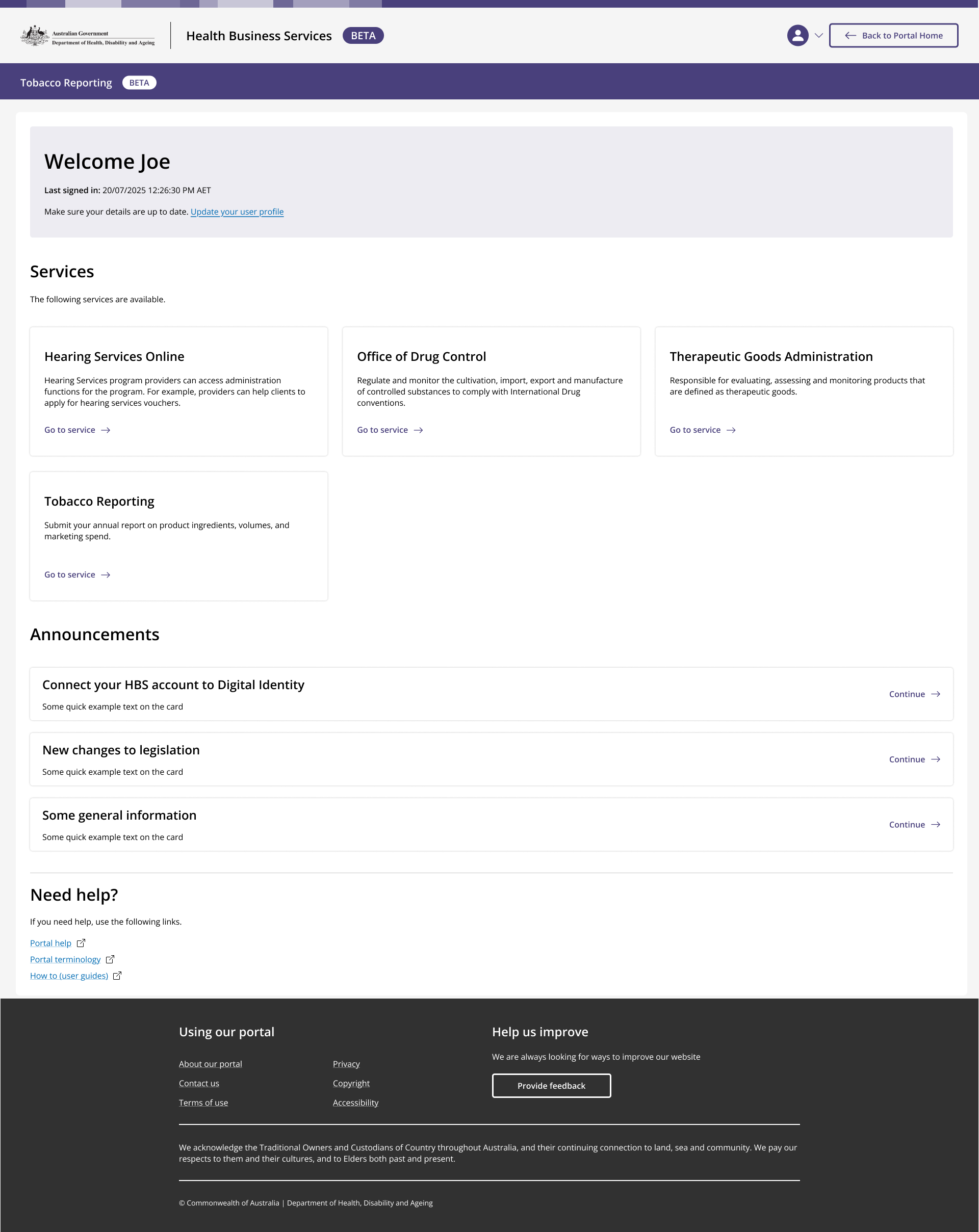
Viewing all linked and available services
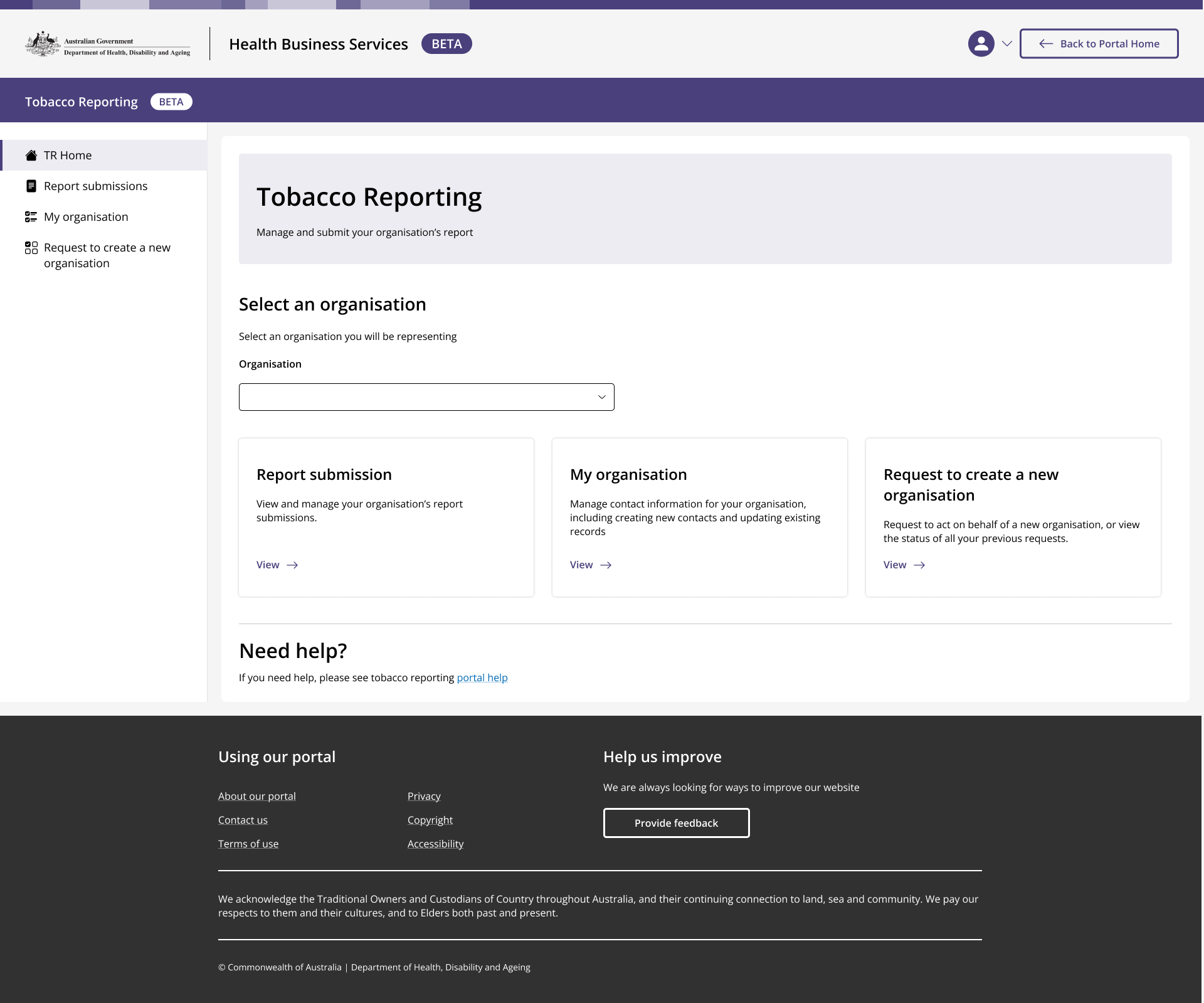
TR Home
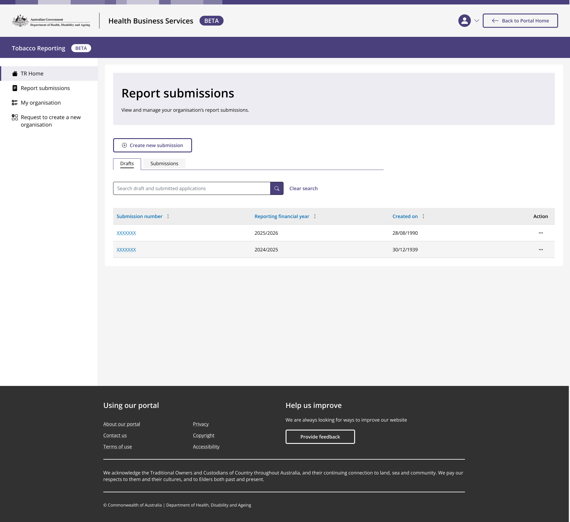
Record of all previous submissions and drafts, and option to create new
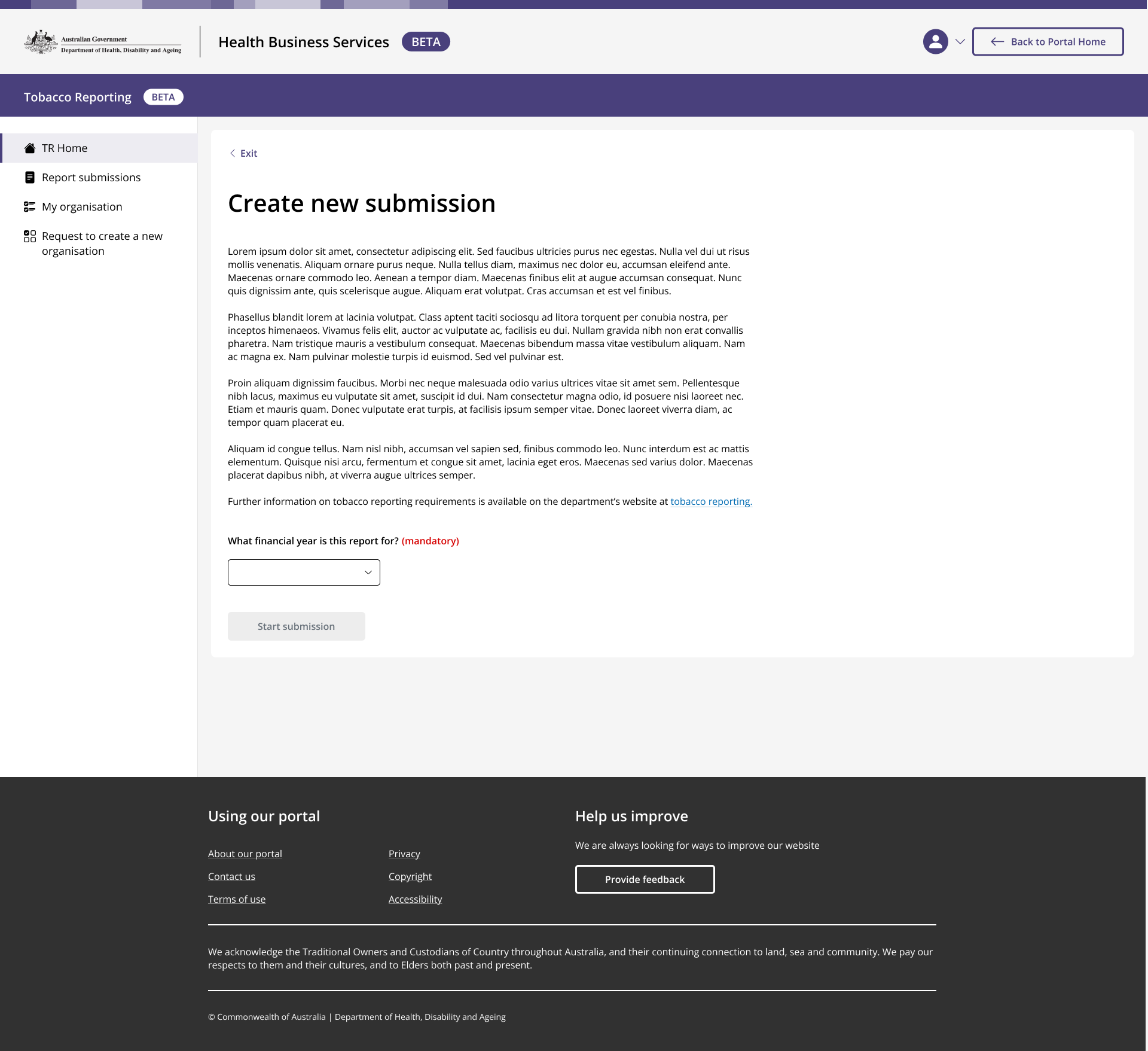
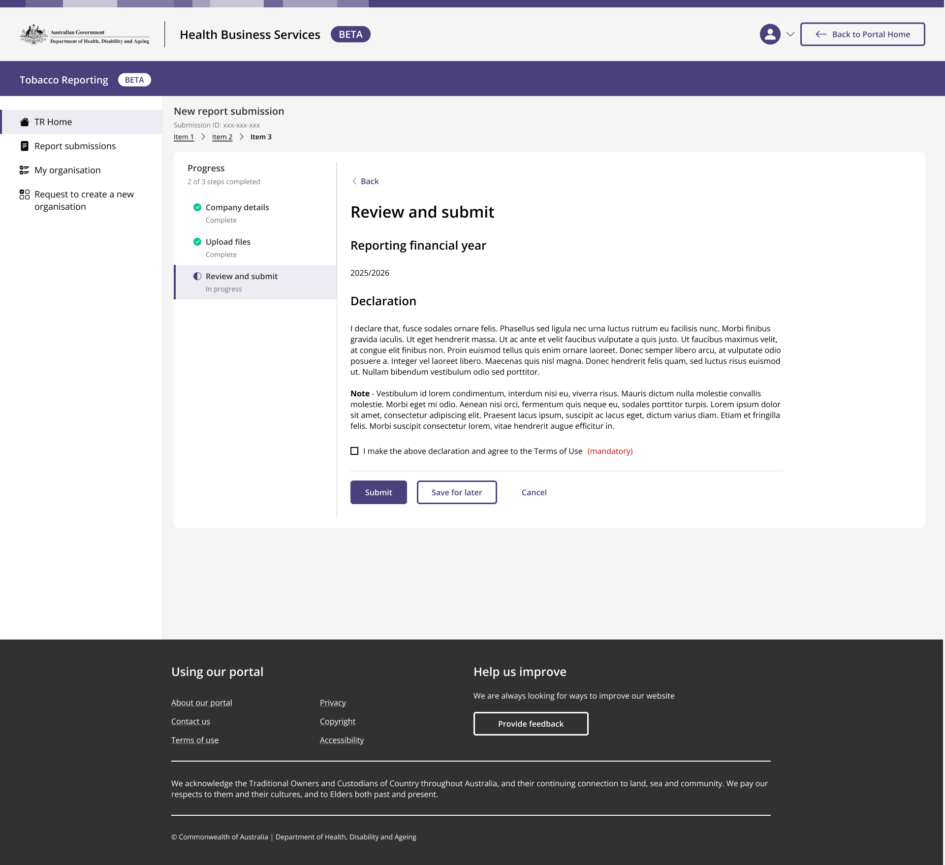
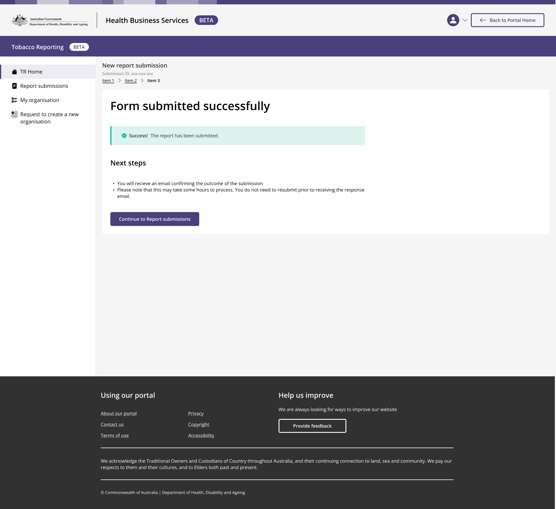
Report submitted
Methodology
50 consumers
Primary user cohort
For example:
A person seeking information about the expected out-of0pocket costs for a colonoscopy performed by a local private specialist
10 general practitioners
Secondary user cohort
For example:
A GP informing a patient about the expected out-of-pocket costs for a medical procedure.
A/B usability testing was used to collect feedback on two different approaches to the future-state MCF website.
60 participants were recruited via Lonergan, a market research agency
Participants were given 3 tasks to complete during a 50 minute testing session:
Finding the typical cost of a service
Searching for fees of individual specialists
Finding typical insurer cost coverage for a service.
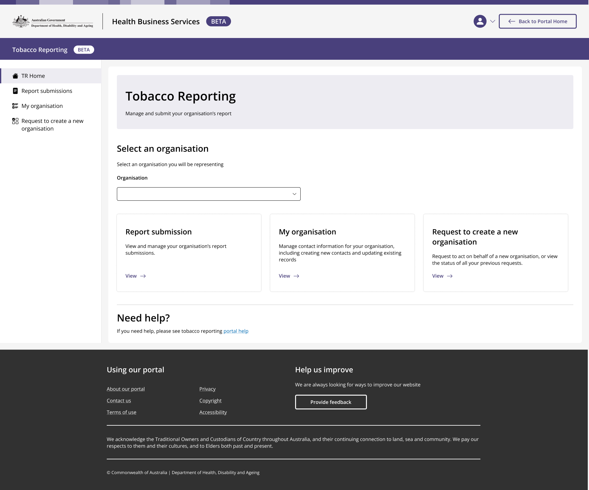
TR Home
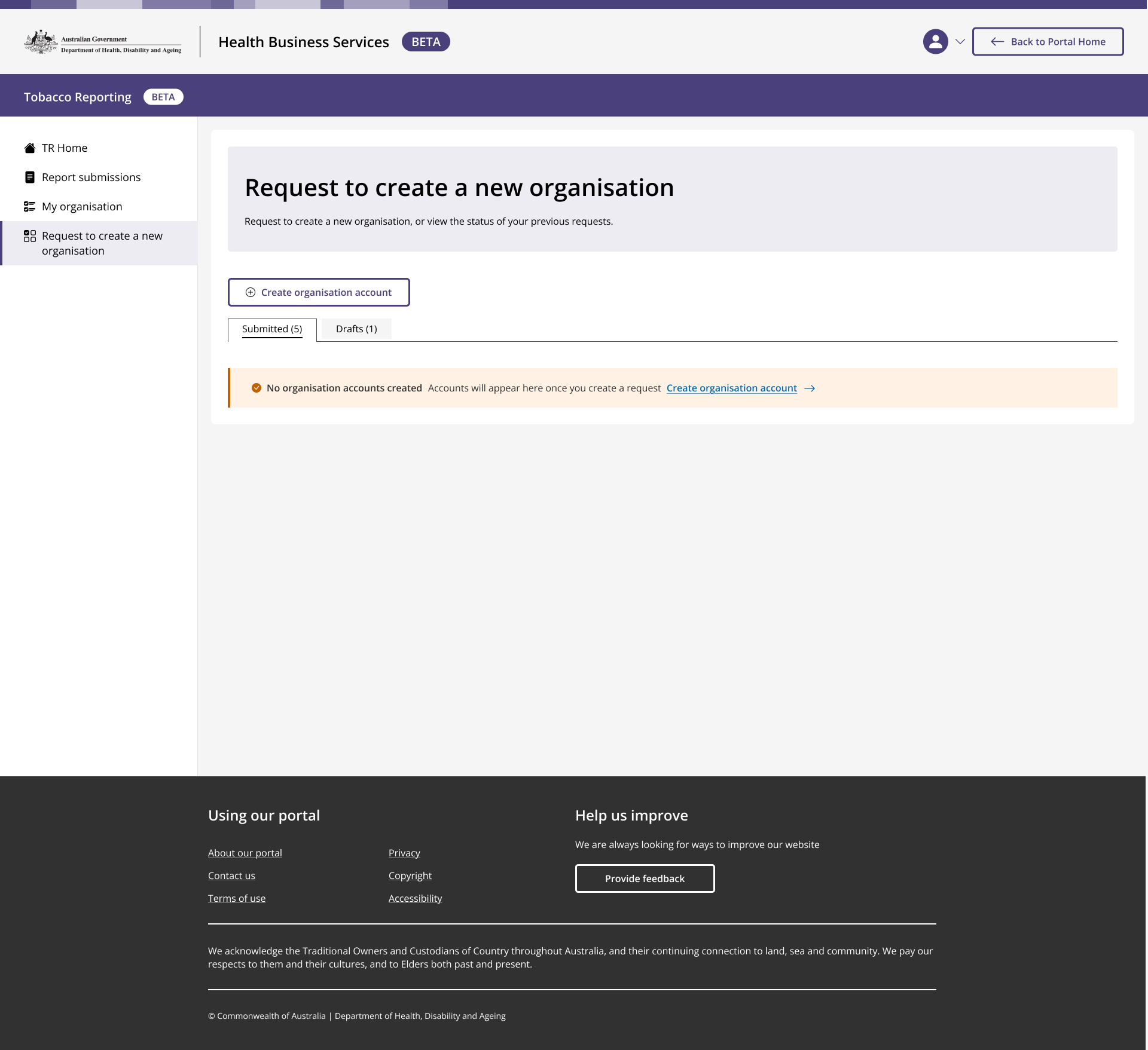
User clicks 'create organisation account', to begin a multi-step form
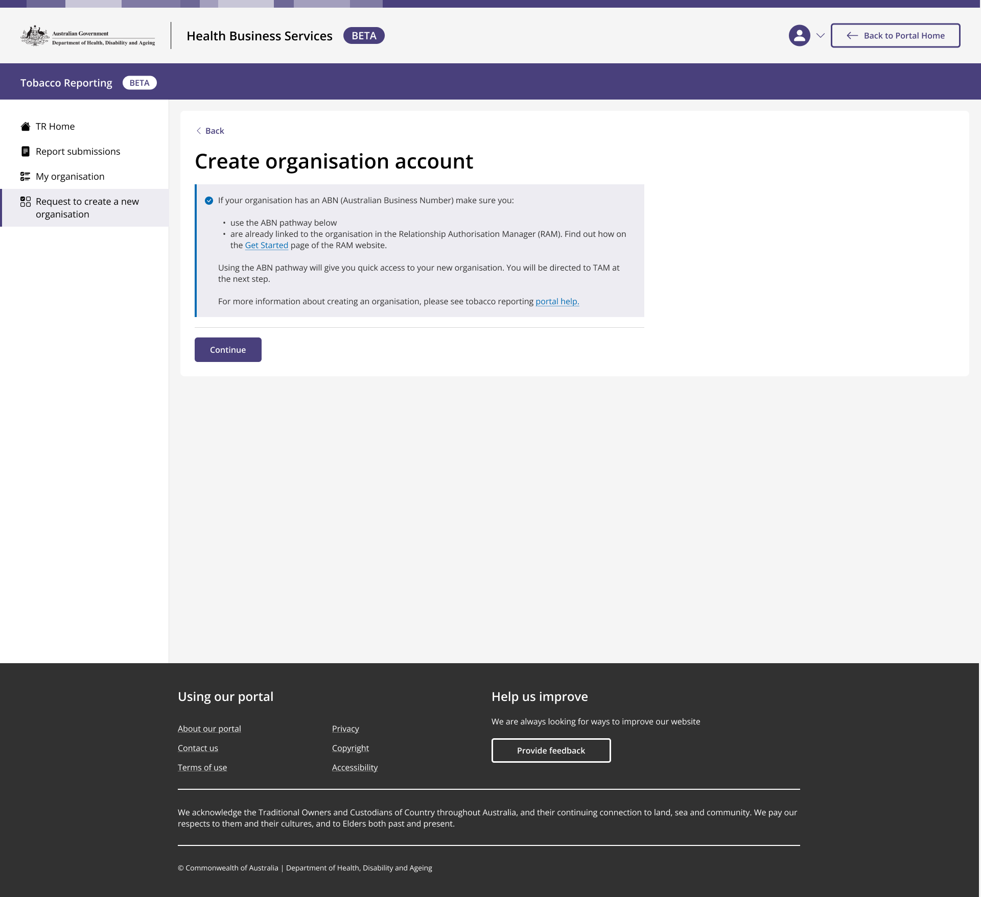
User begins form
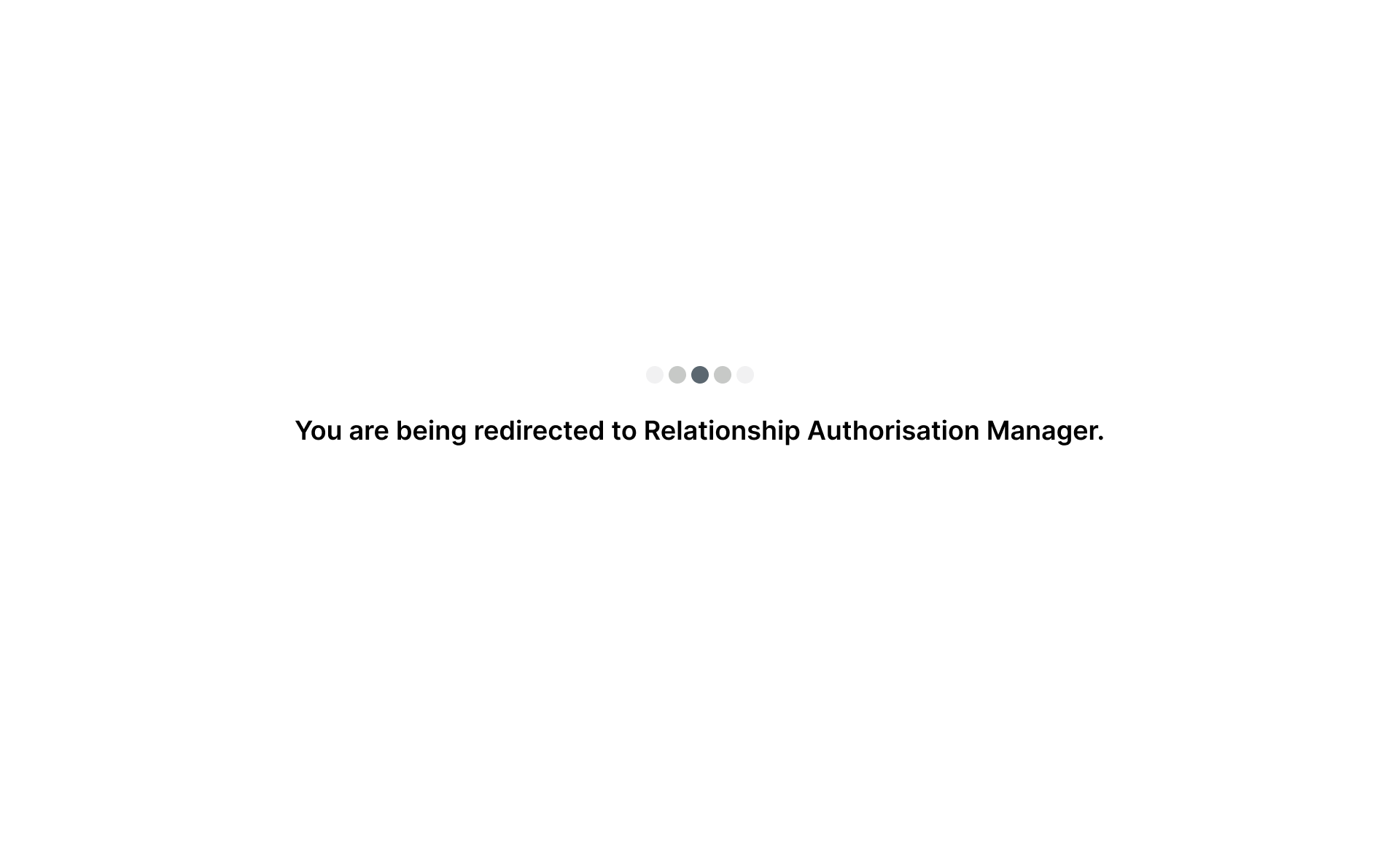
Platform connects to RAM to verify user's relationship to the organisation.
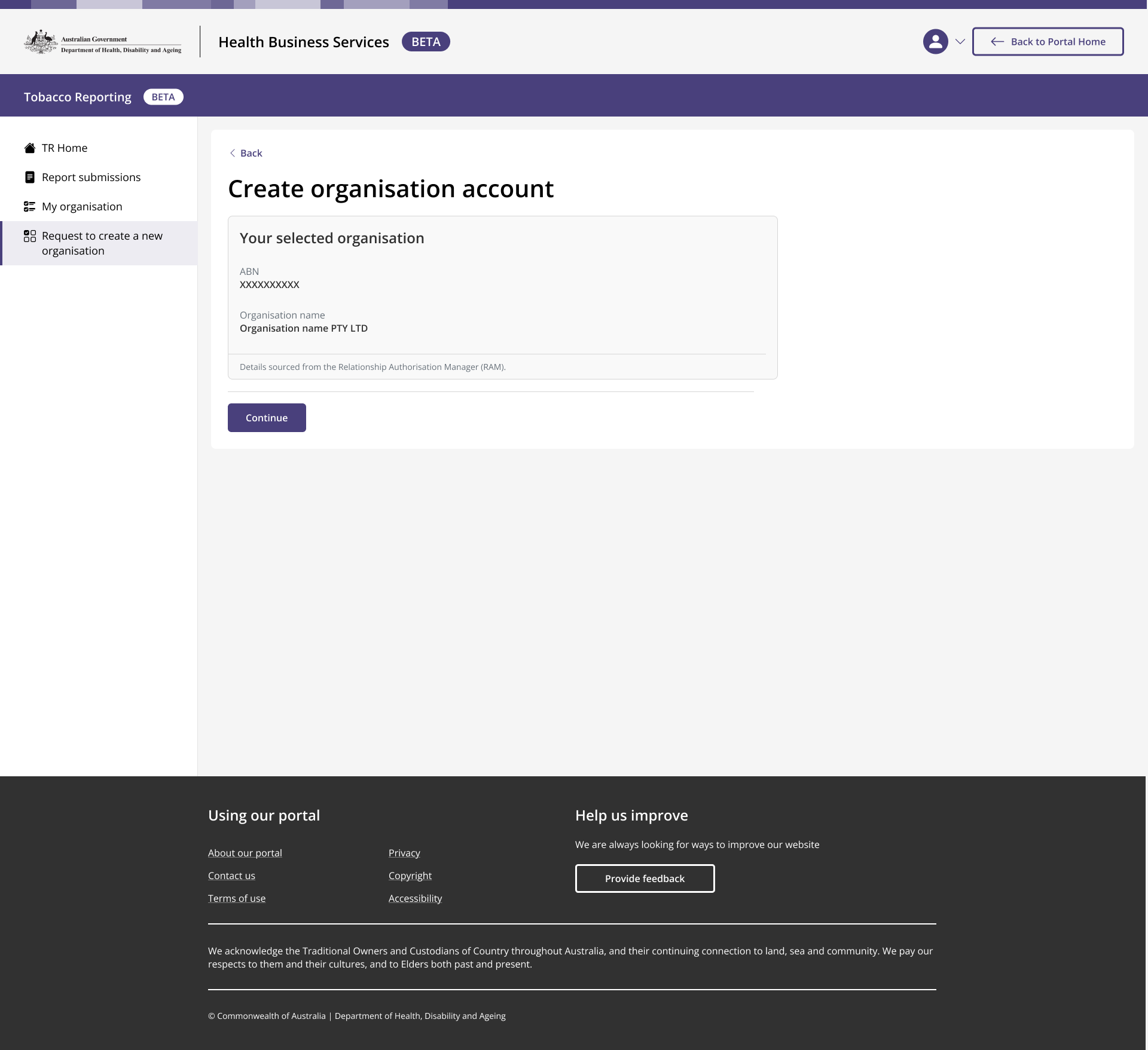
Details retrieved
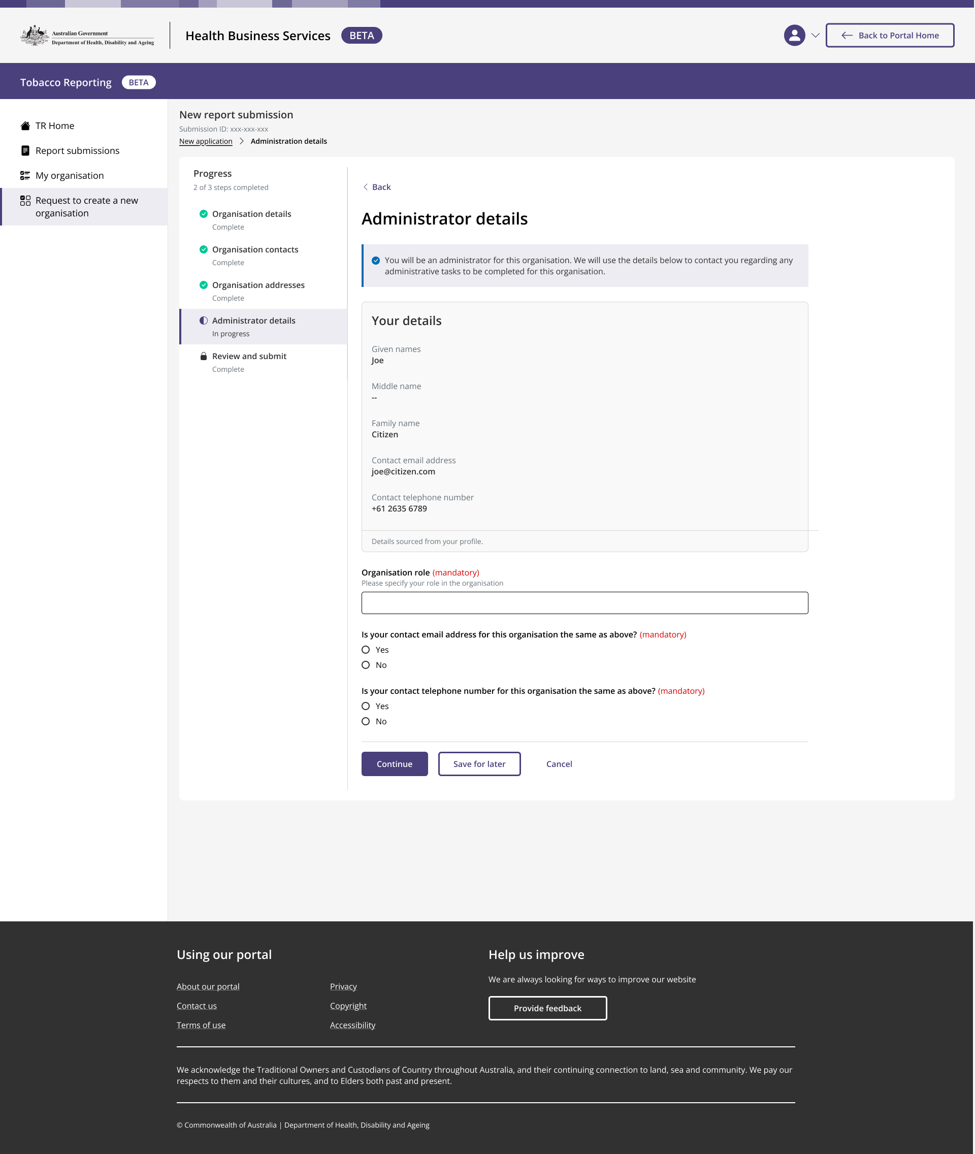
User works their way through multi-step form.
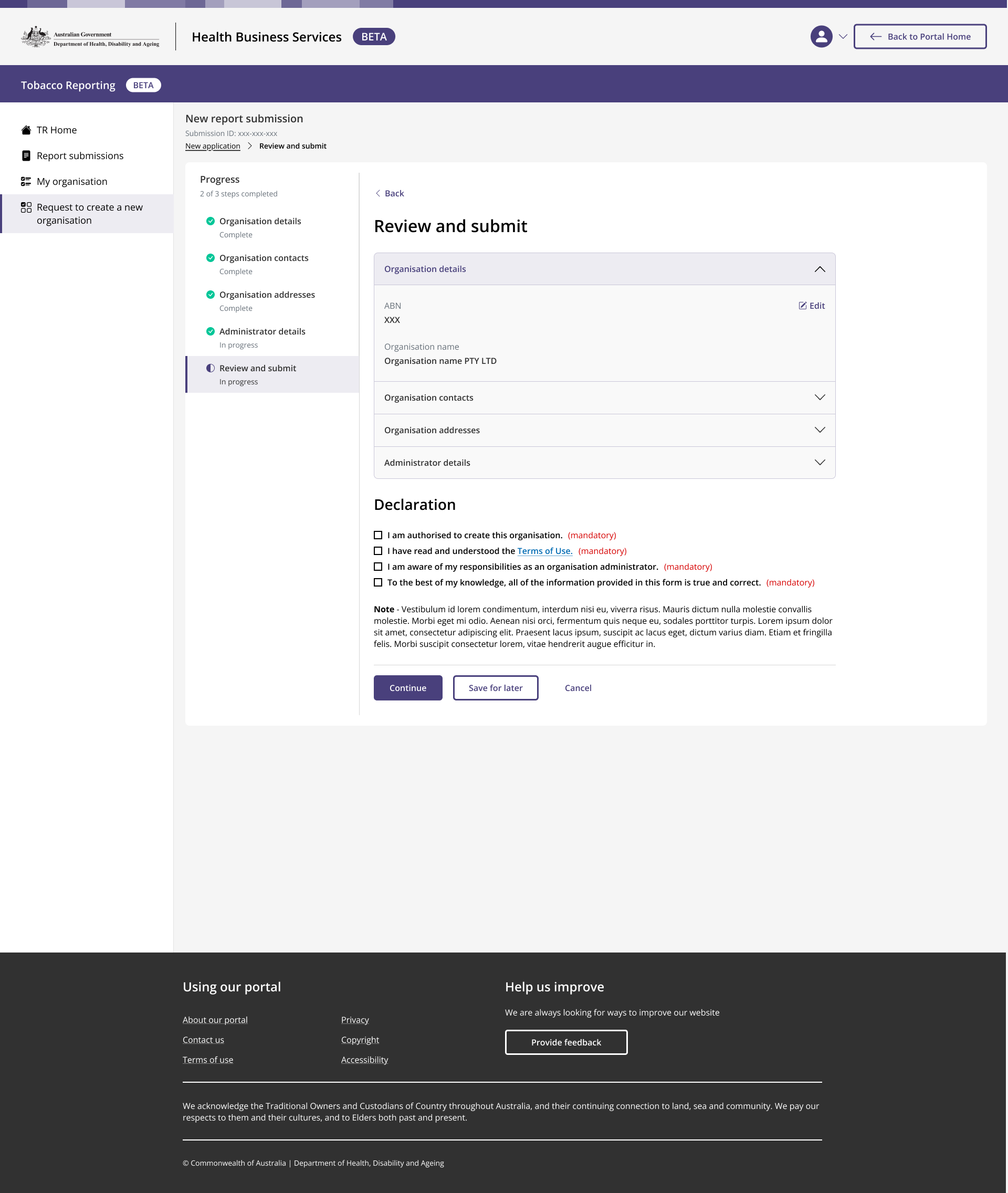
User reaches end of form.
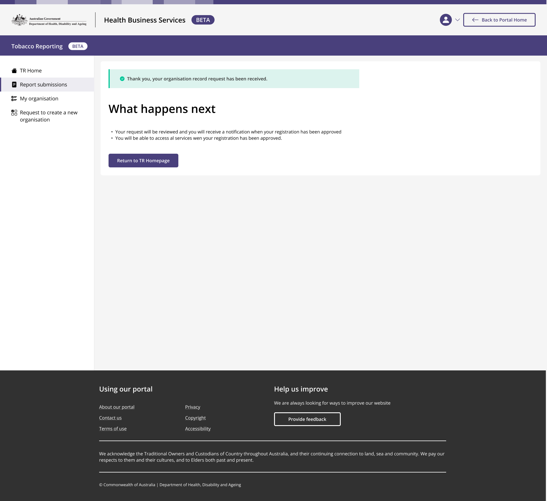
Request is sent to the administrator.
Analysis
A lengthy analysis left my team with almost 3000 data points. From this, we extracted over 50 unique findings relating to service costs, specialist fees, insurer costs and general content.
44+
Hours of interviews
1700+
Qualitative data points (and 1000+ Quant)
419
Observations
53
Unique research findings
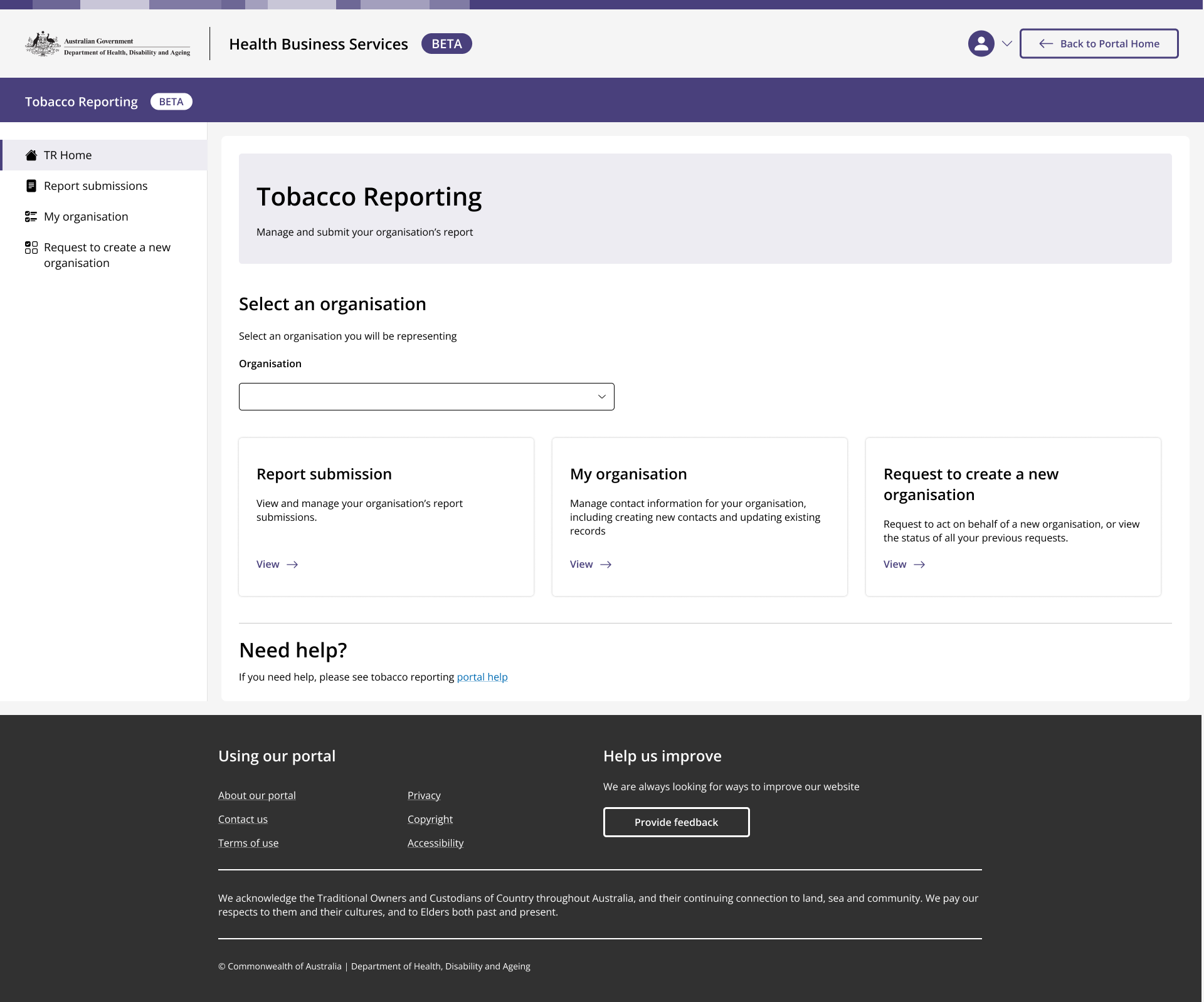
User selects 'My organisation'
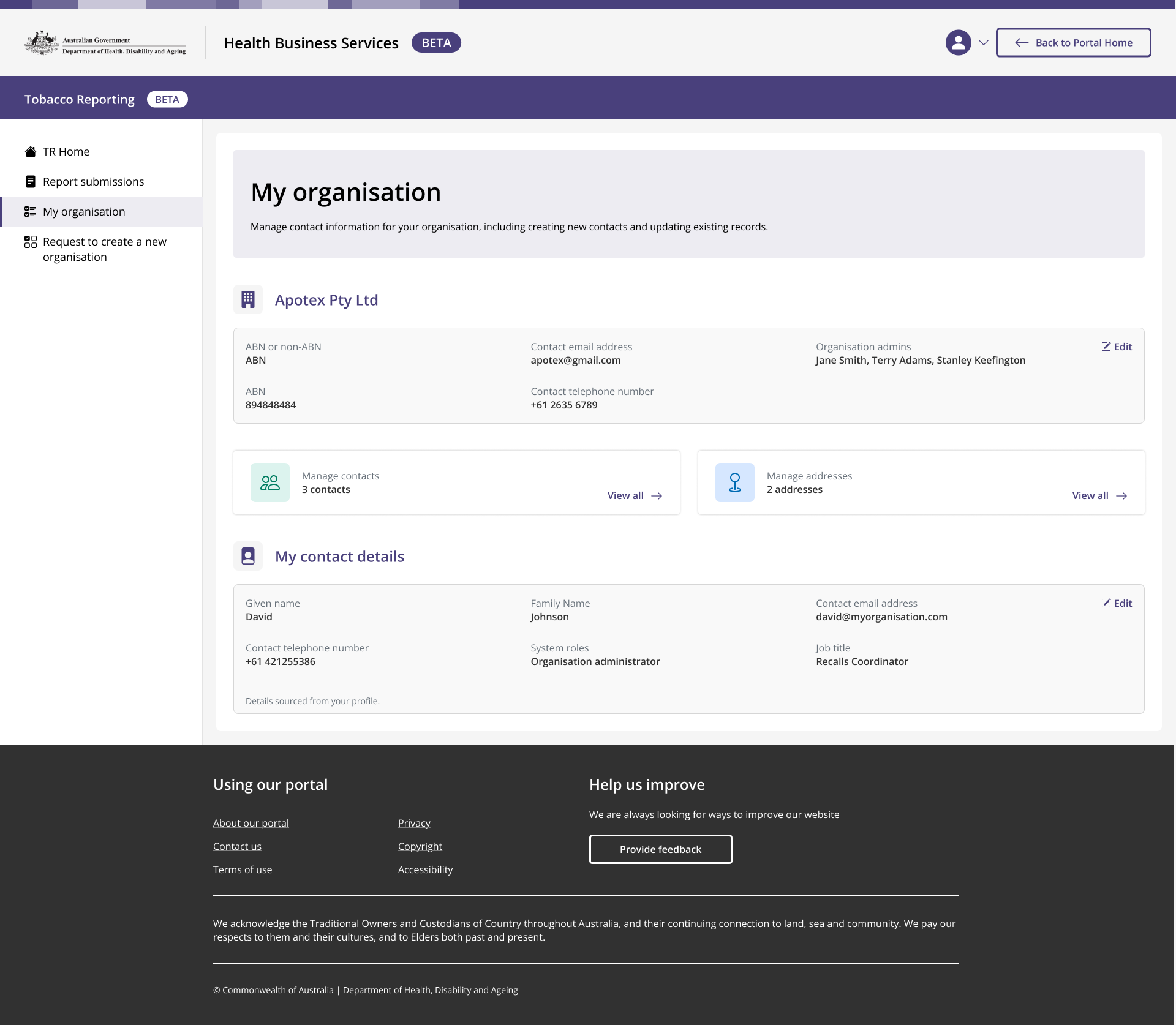
User can manage contacts and addresses (editing only for administrators) and view their details
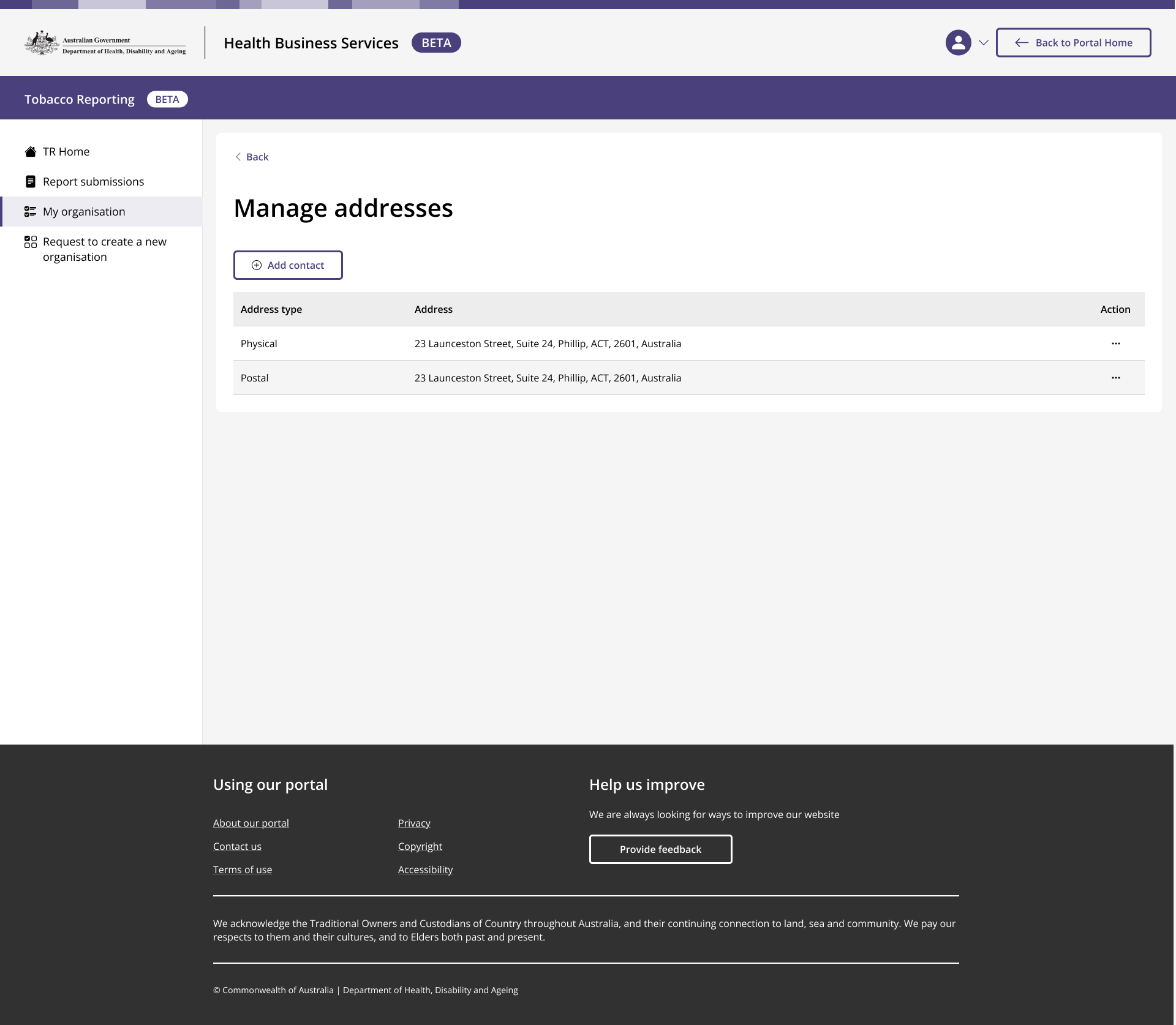
Addresses
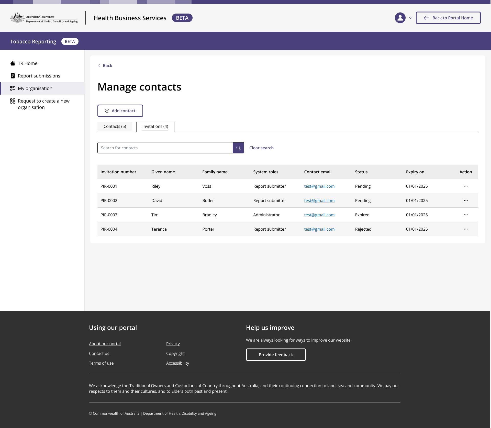
Contacts
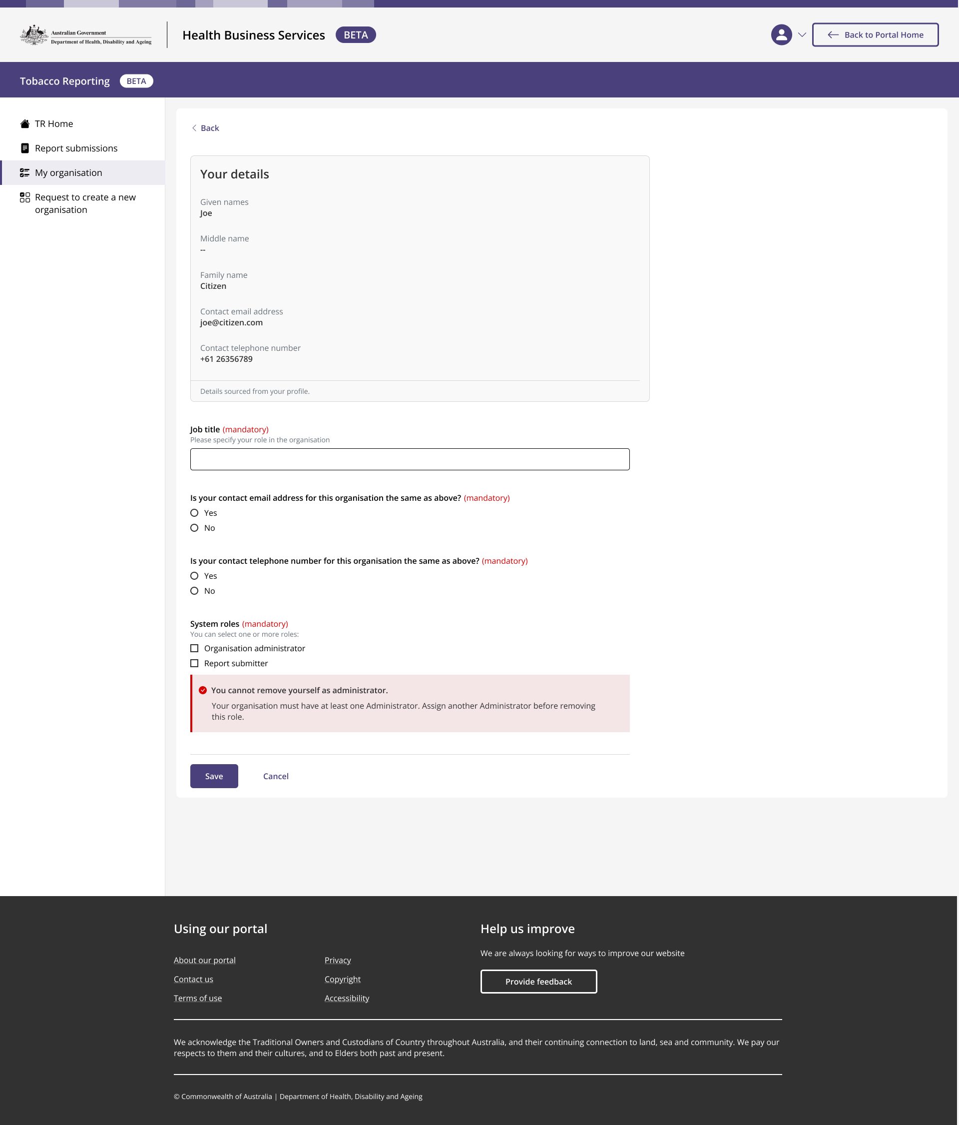
Personal details
Components I designed - Blob storage
Problem
In the multi-step form when submitting a report, users need to upload files. Whilst all other services in HBSP use a Sharepoint storage component, TR alone uses Azure storage instead. This is because the service needs to support up to 3 files greater than 150mb, due to the hefty templates used for report submissions.
This brought about a new technical challenge however, as the Azure storage file plugin is made in a way where two discrete components are stacked directly on top of each other yet don’t communicate with each other in the Out-of-the-box design. This is represented below as ‘Uploaded files’ and ‘upload files’ in the image below.
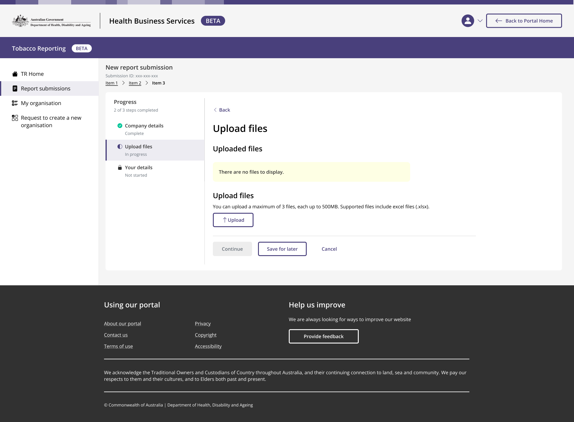
Any files uploaded won’t appear under ‘uploaded' files’ until the page refreshes.
Design system and UI
Because these two sections don’t communicate with each other, it creates a usability issue where uploaded files won’t show under the ‘Upload files’ section unless the page gets refreshed.
This is problematic, because users wouldn’t get feedback that their files were uploading and secondly, the File upload component looks different in other parts of the platform which uses the standard Sharepoint storage system instead of Azure.
I needed to address this usability issue.
Solution
Because the blob storage component was used in a multi-step form, and the ‘uploaded files’ part of the component would take technical effort to remove or modify from its out-of-the-box state, the new design component I created would use a callout explaining to the user when they could expect the files they uploaded to appear - when they continued or saved the step they were in.
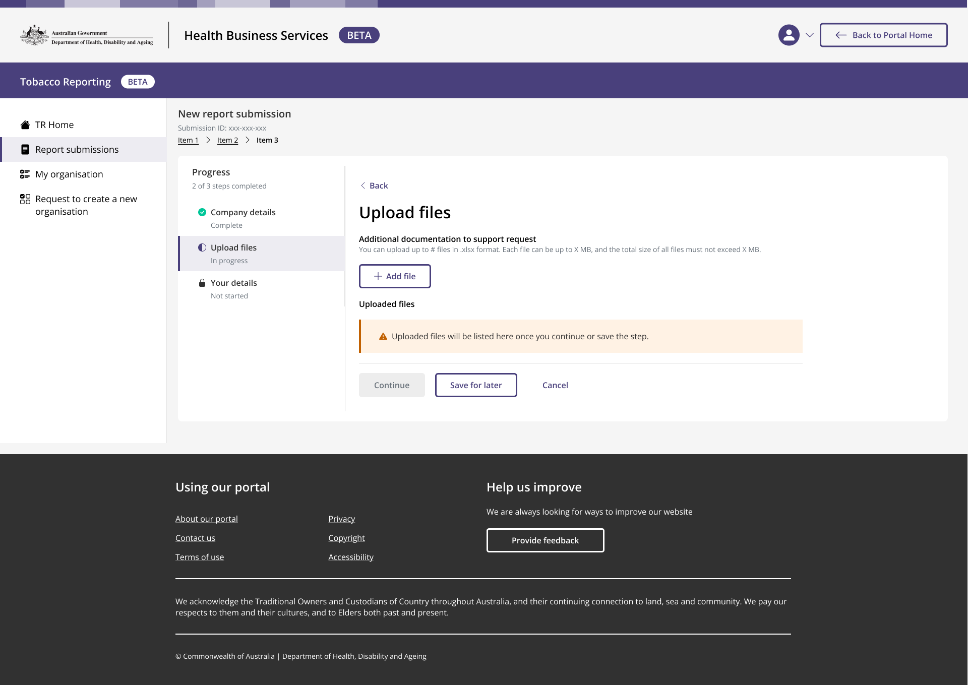
To provide immediate feedback to users that their files are uploading, they would show under the ‘Add file’ section, and change appearance once uploaded.
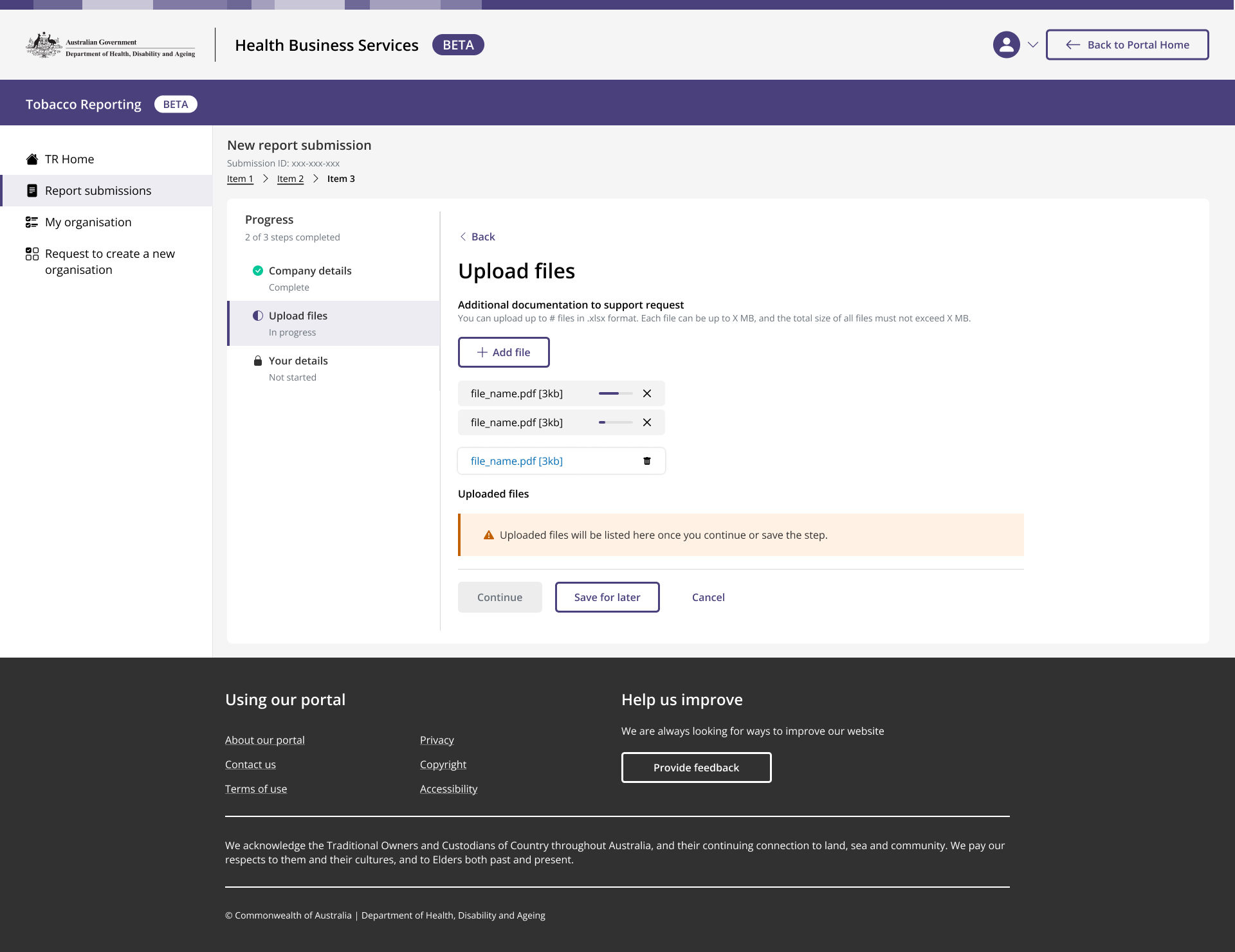
If the user refreshes the page, or continues to the next step and returns to the step, they can see their uploads under ‘Uploaded files’.
I was fortunate to join the team when the foundations for the HBS design system had more or less been established. Colours, fonts, buttons and most of the other atoms and molecules had already taken shape, and so my responsibilities fell more so in giving definition to the organisms, templates, pages and creating prototypes
Components I designed - Table v2
Problem
Solution
I liaised with our design lead and a fellow designer to explore some options for the action column inside table components
-
Each row contains a dedicated icon (e.g. kebab or ellipsis) that exposes actions.
Pros
Familiar interaction pattern
Keeps actions visually associated with the row
Cons
Increases maintenance overhead as action complexity grows
Leads to overloading a single control with too many responsibilities
No longer a common or recommended pattern for complex tables
Would require additional user testing to validate usability
Assessment: This approach does no scale well and introduces ongoing maintenance complexity.
-
Impose a strict upper limit on the number of actions to ensure the menu fits within the table boundary
Pros
Simplifies positioning logic
Avoids layout breakage in theory
Cons
Relies ton teams adhering to design rules - historically unreliable
High risk of rule violations over time
Does not account for legitimate use cases requiring more actions.
Assessment: This is brittle and unenforceable in practice
-
Allow rows or the table to grow vertically when menus are opened.
Pros
Keeps all menu items visible
Avoids overflow outside the table
Cons
Creates large amounts of unnecessary white space
Poor experience when menus are not in use
Unbounded growth if rows contain 10+ actions
Pages become excessively long and visually noisy
Assessment: Solves one problem but introduces significantly layout and usability issues.
-
Replace the OOTB Bootstrap table with a more flexible or custom table component.
Pros
Greater layout and interaction control
Could solve the problem more ‘cleanly’ from a technical standpoint
Cons
Teams strong prefer OOTB components
Higher implementation effort
Increased maintenance and support burden
Adoption resistance from project teams
Assessment: Not viable due to adoption and maintenance problems
-
Use JavaScript logic:
If menu items ≤ 3 → show overlay menu
If menu items >3 → switch to inline accordion
Pros
Optimises UX for small and large menus
Keeps compact interactions where possible
Cons
Heavy JavaScript complexity
Unrealistic for CRM and delivery teams to maintain
Difficult to test and debug
High implementation cost across all tables
Assessment Technically possible but operationally unrealistic.
-
Each table row can expand vertically (accordion-style) to reveal actions inline.
Pros
Scales to support 10+ menu items without layout issues
Keeps all interactions within the table boundary
Predictable, accessible interaction pattern
Only requires JavaScript from a frond-end perspective
Allows enhanced visual cues:
Icon changes (chevron up/down)
Colour or state variations for emphasis
Cons
Requires JavaScript (though limited and manageable)
Slightly different interaction from traditional tables
Assessment: THis approach is scalable, robust and aligns with modern UI patterns. It balances usability, technical feasibility and long term maintainability.
Once settled on converting rows in accordions, we came up with the following variations. After consulting with the rest of the designers in the UX/UI team, we settled for Option 4 (see below).
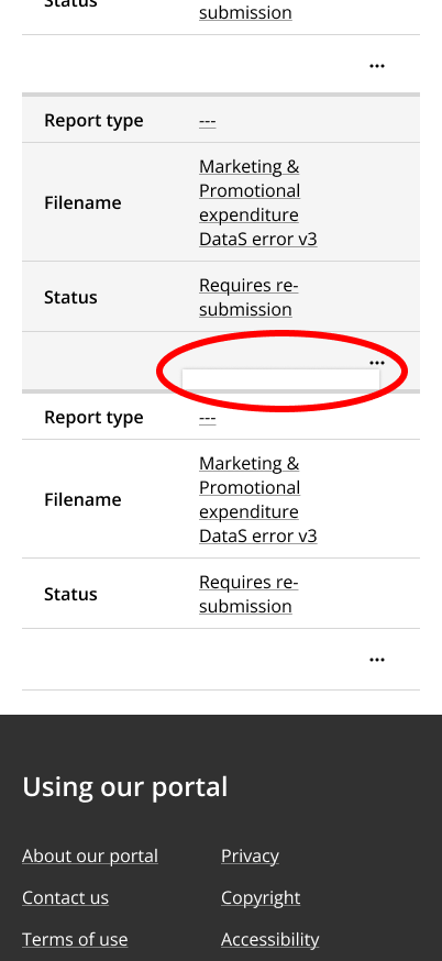
When one of my developers were enabling the tables in the TR platform, he noticed that the modal in the action column would hide in some screen sizes.
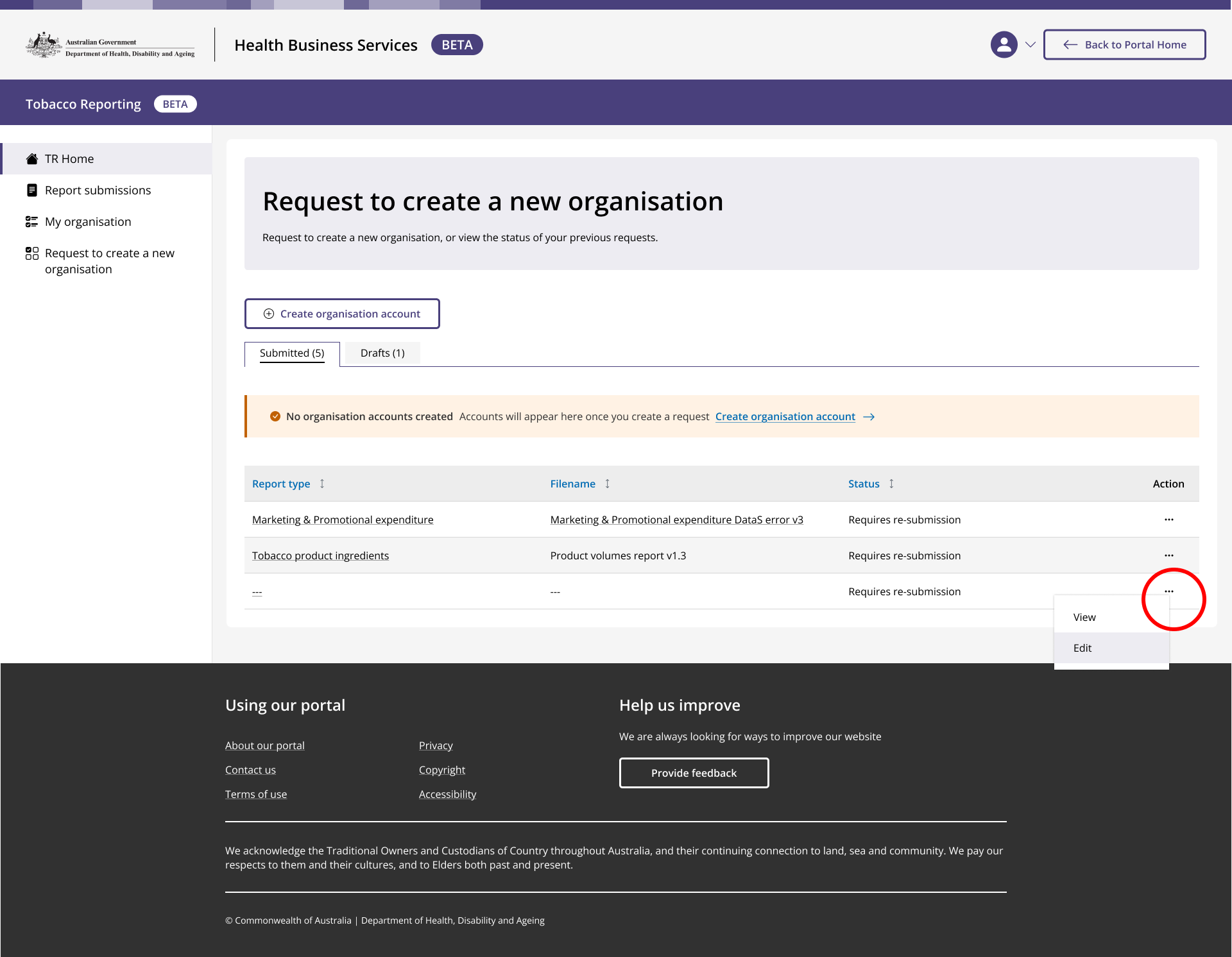
Action menu items triggered at the bittom of the table, hide within the frame of the table. This is especially the case in a mobile view.
I reached out to our Design Engineer to see if he could update the design system so that the modal functioned like an overlay, displaying over content instead of hiding within the frame of the table component.
There were technical restraints to this however - the Out-of-the-box (OOTB) Bootstrap tables render action menus using absolute positioning. As a result, menus must remain within the table boundary and cannot overflow beyond it. This in turn created usability, layout, and scalability challenges - especially when rows contain multiple actions.
Tables are widely used across the HBSP platform, not just the TR service and so any solution must be low-maintenance, scalable, and realistic for delivery teams to implement consistently.
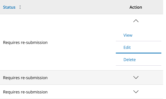
Option 1: Chevrons, left aligned, and no icons (but we can have them). Hover indicated by a thicker line.
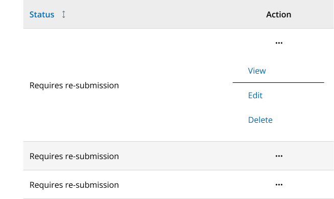
Option 2: Keeps ellipsis icon, left aligned, each action is a text button, hover state has an underline and background colour applied when cell opens.
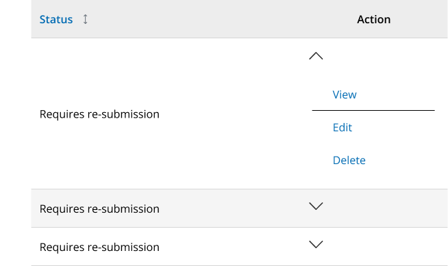
Option 3: Similar to option 1, except action is a text button
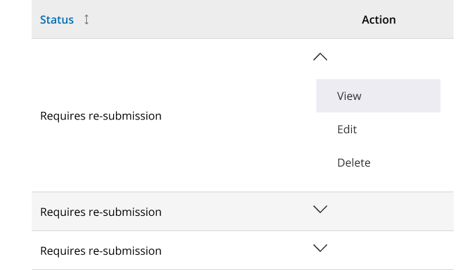
Option 4: Similar to option 2, but with cell background in a hover state.